
Responsive sites over mobile versions
Responsive sites over mobile versions
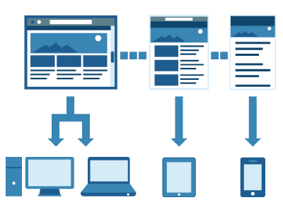
Responsive design, a technology that stretches or shrinks Web pages to fit differently sized screens, has emerged as the most-often recommended manner of optimising content for mobile devices.
This dominance was cemented in mid-2012 when Google recommended responsive design as the best strategy for smartphone-optimised websites. (There is some self-interest at work here, since it helps Google’s algorithms index the content.)
But the rise of responsive design has been gradual — not lighting-quick like the wider phenomenon of smartphone adoption. Some trace its beginnings to a now-famous 2010 article, titled “Responsive Web Design,” by web designer Ethan Marcotte.
Responsive design’s rise is also a side-effect of the mobile revolution. There will be 2 billion mobile devices in people’s hands globally by 2014, according to Flurry analytics.
As the iPhone, Android phones, and iPad became bestselling consumer gadgets, businesses realised their Web presence needed to translate to those smaller screens. Otherwise, their websites would bear tell-tale signs of a business clueless to mobile: tiny text, tinier links, and a jumbled layout. They risked lost traffic and sales.
These days, responsive design is recommended as the gold standard. But as with most technologies in a multi-device world, it has disadvantages, and it’s not right for every business, or every application.
In this report:
We’ll review responsive design’s pros and cons.
We’ll offer charts and statistics that track responsive design adoption and performance across mobile.
We’ll also evaluate whether dedicated mobile websites have their place. The ramifications for HTML5 will also be detailed.
But first, let’s consider responsive design alongside the other mobile optimization tools, and define each.
BIIMobile apps: Particularly at the beginning of the mobile boom, when some believed apps would channel virtually all mobile activity, businesses rushed to create apps. Apps may be dominant in some mobile markets like the U.S., but consumers use their mobile browsers too — and not just for casual browsing, searching and information look-ups. A great deal of e-commerce happens in the mobile Web browser, not in native apps. Not to mention: Apps are expensive. Apps are not the be-all, end-all for mobile.
Dedicated mobile websites: Some usability gurus advocate for separate mobile sites that offer a stripped-down version of its content and carry their own Web address (often with the URL that looks something like this: m.website). These mobile-only sites tend to perform very well in terms of load speeds.
BIIResponsive design: In responsive design, the same Web code or HTML is delivered to every device, but tweaks to CSS code — which determines the layout of Web pages — allow it to determine the device size and adjust layout accordingly. The website maintains the same Web address or URL regardless of what device it’s seen on. In sum: The fluid layout means that content adapts to all form factors, even smart TVs — a fast-growing source of Web traffic. A variant is called Responsive Design With Server-Side Support. The difference is that the computer server that hosts the website will deliver different batches of HTML and CSS Web code depending on what device the user is on. This method solves some of responsive design’s performance issues, but requires device detection. It means a company can use responsive design and enjoy its advantages where it wants, but deploy more customised components too. It may deploy responsive elements across mobile, while keeping a more traditional fixed layout for the PC. It may even deliver customised experiences for certain device models (like a feature that only works on retina screens, etc.).
A variant is called Responsive Design With Server-Side Support. The difference is that the computer server that hosts the website will deliver different batches of HTML and CSS Web code depending on what device the user is on. This method solves some of responsive design’s performance issues, but requires device detection. It means a company can use responsive design and enjoy its advantages where it wants, but deploy more customised components too. It may deploy responsive elements across mobile, while keeping a more traditional fixed layout for the PC. It may even deliver customised experiences for certain device models (like a feature that only works on retina screens, etc.).
Let’s return briefly to our original question. What is responsive design?
Responsive design is not just a technology, it’s also a philosophy for how to best deliver content across devices.
Responsive design says: Let’s create a single website and experience, and build it so that it looks great, no matter where it’s viewed.
As we’ll see, that approach brings considerable benefits, but some limitations too.
Businesses that adopt it need to do so with their eyes wide open.
Return to top of report »
Limitations To Responsive Design
At first, it wasn’t fully clear to businesses how they should go mobile.
Apps? A mobile website? Responsive design? What’s that? What about tablets?
The variety of mobile optimization tools and solutions on offer created a great deal of confusion.
That may help to explain why so many businesses were slow to optimise their content for mobile (mobile optimization is just a fancy way of saying content that looks OK and functions properly on smartphone and tablet displays).
Responsive design is a powerful approach. But it isn’t a silver bullet.
For example, it has drawn fire from the mobile ad crowd, since it has trouble supporting some advertising technologies.
Before assuming that responsive design is the proper path, one should review its limitations, and dismantle some of the hype that has grown up around it.
BIIIt’s not a cure-all: The first misconception around responsive design is that it is right for everybody. It depends on your specific mobile strategy, and the resources at your disposal. If you’d like to publish different content to mobile and desktop, especially if your business model depends on differentiated experiences — and you have the content management (CMS) system to manage that efficiently — then responsive design definitely isn’t for you.
An example of responsive design gone wrong was recently highlighted by Bryson Meunier at Search Engine Land, who showed how Disney’s responsive site promotes games that can only be played on the desktop site.
It isn’t easy to get right: In the words of mobile analyst Frederic Filloux, it’s “great in theory but extremely difficult to develop and the slightest change requires diving into hugely complex HTML code.” Testing responsive sites on different device types and permutations of browsers and operating systems can turn into a headache. It isn’t necessarily cheap: There are off-the-shelf solutions to create mobile-ready websites that can be much less expensive than paying a team to build a top-to-bottom responsive design website. If all you need is a website with some basic business information so that customers can find you, and don’t plan on frequent content updates, you may not need to invest in responsive design. BIIIt can be very slow: In a strict responsive design approach, your mobile website contains the same amount of information as its desktop version. That means quite a bit of server-side data that must be accessed by a device, and that means smartphone processors may take a long time to sift through it, even if the content doesn’t ultimately show up on your device. Hence: slower download times for responsively designed sites, compared to mobile-only sites. This “over-downloading” problem, often compounded by data-heavy images, can be alleviated, but it’s not easy.
For this reason, many commerce-focused websites, who worry about abandoned shopping carts and lost sales with slow mobile sites, often prefer a mobile-only website.
Advertising is still tricky: Responsive design “makes it hard to do ads right,” according to Digiday. Why? Many ad units themselves aren’t responsive yet. They won’t adjust to different screen sizes. Some publishers have come up with back-end workarounds that swap unfriendly units for responsive ones. Others simply sell only medium sizes that display well on all screens, and avoid the top-of-page “leaderboard” banner units that don’t translate to mobile.
Undertone has launched “Screenshift,” a responsive ad format that appears as a full-screen ad in mobile, and as a “pushdown” type ad that expands mid-screen on the desktop.
Despite the problems with responsive design and ads, many ad services advocate it as a “best practice.” Adcade, a rich media advertising specialist, has done so.
Images and video still cause problems: Responsive design has come along in this area, but there’s still a tendency for it to run into trouble when it comes across a page that is video- or image-rich. These pages can appear messy on mobile, or simply fail to work. Resizing of images for different screens and resolutions (e.g., retina displays) can become a problem.The great advantage of responsive design is that businesses that use it do not have to maintain separate versions of code for mobile and desktop websites. Well-executed responsive design means that the user experience will be great across all screen sizes.
But that doesn’t automatically mean that the mobile user experience will be top-notch, or as heavily customised for mobile as some may desire. Responsive design involves many decisions about how content will scale and shift as screen sizes vary. Developers will have their work cut out for them.
Nor does responsive design mean that the desktop site will leverage all the most advanced features available in today’s PC web browsers.
Disney’s PC-based web games that didn’t work on mobile, which we cited above, are just one example.
Even Ethan Marcotte, considered by many the father of responsive design, has argued that it should be seen as one option, not a replacement for mobile websites.
“A replacement for mobile-specific websites? Oh, not at all,” Marcotte said in an interview with design magazine .net. “Basically, I think of responsive design as an alternative to mobile sites, as another option to be weighed when beginning a project. … Historically, we’ve often treated ‘mobile’ and ‘desktop’ as synonyms for ‘less’ and ‘more’, designing distinct experiences for each, and fragmenting our content into those separate sites. And that might still make sense for your work, if the content merits that approach.”
Some enterprises that have the resources for it will want to present their content differently on mobile. They may actually want to suppress some content altogether on mobile, or show users different pieces depending on the device they are on.
Responsive design elements can still be part of their mobile development palette (Amazon uses responsive elements in their separate mobile website), but it won’t be the only strategy at work.
Netbiscuits, a mobile development company, contrasts its approach to responsive design by calling it adaptive web technology. Essentially, it is responsive design with a great deal of server-side support.
Netbiscuits addresses many of the shortcomings to responsive design, such as the over-downloading problem, by detecting devices on the server-side and then delivering code that’s optimised for that specific device.
“We can create incredibly customised experiences to the devices … beyond what responsive design can do,” Stephan Haux, Netbiscuits director of product management, told us.
Return to top of report »
Responsive Design Advantages
Well executed, responsive design is an inherently clean and elegant solution.
It’s simple: changes made to a Web page are instantly translated to different screen sizes. In practical terms, that means there’s no need to update a separate mobile website whenever a change is made to a website or new content is added.
That can save a great deal of time and effort, and creates a clean and homogeneous cross-device experience for your audience.
Let’s summarize the advantages briefly, before going into a little detail about the rationale behind responsive design.
Time and long-term money savings: Responsive design isn’t cheap, but it can mean long-term savings. Theoretically, a mind-bogglingly complex set of specialised decision and rules regarding site design for different form factors is reduced to a few style templates that stretch to fit difference device types. With tweaks, most devices and many edge cases should be supported.
The definite advantage is that responsive design is a time-saver once it’s implemented, since only a single version of the basic Web code is needed.
One site, one URL: Responsive design eliminates duplicative mobile websites with separate web addresses, which can throw off search engines and reduce a site’s visibility in search. No one needs to invest time and effort in maintaining a separate site for smartphones. The viewable area of the website automatically rearranges itself to fit within the device’s screen size.
No sandboxing or quarantining: This is related to the above, but it’s worth pointing out separately. The responsive design paradigm means no piece of content is boxed off from the rest, into its own device-specific bucket. Content moves cross-device, so it must all be created with a multiscreen world in mind. This means an entire organisation must think cross-screen.
Uniform user experience: This is perhaps the most persuasive single argument in favour of responsive design: It makes sites more usable for the ordinary person, who won’t become disoriented when they visit websites from different devices. Websites will look and feel the same no matter how one logs on. The mobile navigation will echo desktop navigation and vice-versa. Tablet-friendly: In the U.S. alone there are 80 million tablets in circulation. It’s a little strange that many businesses invest in separate smartphone-optimised sites, but disregard tablets. In those cases, Google recommends showing tablet users a desktop site instead of pages designed for smartphones. But a responsive page fits snugly to a tablet screen. Leverages HTML5: The new version of HTML is built on the idea of the “Open Web Platform,” a multiple-device Web that migrates seamlessly across devices, and can access native device features — like the camera and GPS — much as downloaded native phone apps do. Responsive design means HTML5 can deliver this experience to mobile without having to be created specifically for use on smartphones. Responsive design has helped accelerate HTML5 adoption. Desktop stretch: An added bonus is that responsive design sites perform well on the desktop when users shrink their browser window to multitask. It’s useful to have a design that still puts your key content front-and-centre even when users have reduced their browser window.Another way to put it is that responsive design takes all the complexity created by our multi-device world, and reduces it to a single problem: screen size.
It takes the elements of a PC or desktop page and reorders them into tablet and smartphone-friendly schemes.
Take an average multi-column, feature-rich homepage. On a smartphone, everything would be pushed into a single column or stream, with the elements flagged as most important pushed higher. Navigation is often condensed into the so-called hamburger icon that has become standard in mobile apps.
Important elements like a “buy” button can be prioritised, and scaled to size appropriately.